When it comes to designing in my house it's a process. We got married and had no furniture at all to bring to our apartment. Once we were in the apartment we bought only some furniture and used my Nana's furniture in the mean time (Happy Birthday Nana...I miss you!)
So when we moved into our house well we had some piece that took priority like a kitchen table and appliances. Not a ton of money to spend on other things like rug,pillows, and curtains. It's a process for me. It takes time and money which sometimes I don't always have.
But I am working hard on making our living room the way we envision it to be.
When we first bought the house the room looked like this:
Kind of hard to see but the previous owners I think...overstuffed the room with large pieces....or should I say grand pieces. Worked for them....just not for Nick and I.
So about a year ago (you can tell from the Christmas lights) our room looked like this:
I was in love with it. I had just gotten all new furniture. It was like Christmas came early when I got the sofa! However what the picture doesn't show you is that the rug is so paper thin and cheap from target and that lamp next to the couch is actually on a black folding chair. I was working trying to find what I really wanted the layout of the room to be.
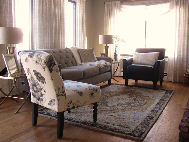
Now it brings us to 2013. I am more focused on this room then ever because it's the first thing you see when you walk into our house. So it should be put together right? Well I still have about three or four more pieces of furniture to go...and more decorative accessories. But I am loving the space.
I found these great end tables that were black from target for super cheap. I took out the black glass and had new pieces cut. Then I spray painted the bases gold (shocker I know!) But I needed something that was elegant with clean lines and glass so it still added furniture but doesn't make the space closed in.
Here is a better shot of the side tables. I still love everything about them! But I know gold isn't for everyone.
I switched out the Target rug and put in this beauty from Potterybarn. I have loved this rug for so long. Sadly I must be the only one because its discontinued! But that means I got it on a great sale price!
I have moved so art around. My sister-in-laws painting now hangs next to our front door for all to see. I get so many complements on the piece. Also I added some sheer swag to the large window. I plan on doing it for the smaller ones too...just need some time to get that done.
I moved the ottoman over to the piano as a bench for nick. It has glamor with the nailheads and the blue and tufted characteristics just help with the overall look of the space. The gold frame I got from my neighbor for free!!! I plan on painting my own picture and swapping out the flowers for something a little less traditional.
These lamps may or may not stay I haven't decided yet. But I love that the burlap shade helps to give the room a little more texture and a warmth of a nice neutral color. And of course my room has a bird...it is my room and expresses who I am.
I think it's coming together nicely. I would like to put a sofa table behind the couch and then in the corner by the stairs (not shown) add another piece of furniture (not sure what yet) so it's more of an entry feel and helps not to leave dead space.
Thinking of hanging some art in this corner. Very sleek an less chunky like the gold. Or toying with the idea of a thin open bookcase?? Who knows. It will probably take me a year!
Here is the reason why I moved the ottoman. The rug is just to pretty in the middle to cover up at this point. But I know I will have to have something in the middle eventually. Just haven't been inspired yet.
What do you think? Do you like it? Have you noticed progress in a room you have that once was bare and now slowly you have built design layers into it? Show us!
-Deirdre


No comments:
Post a Comment